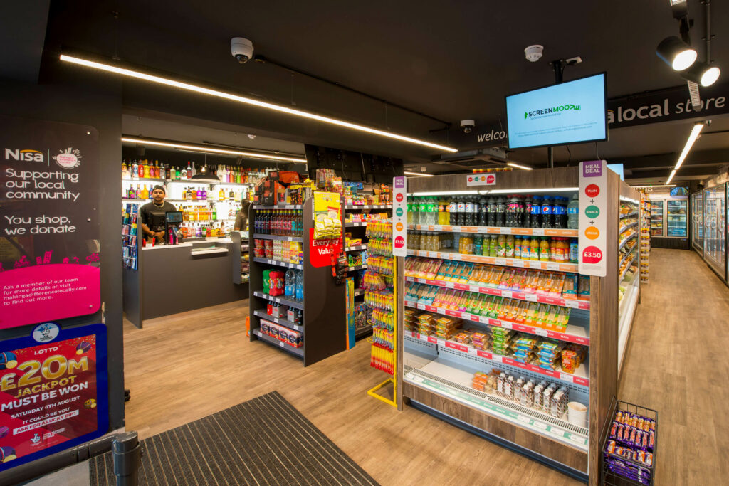
The existing store was a traditional corner shop aesthetic, albeit with a large internal footprint. The front of the store was uninviting with the retail layout needing upgrade, with it being dark, varied colour palette and a disconnected product range.

